
Logo variations: what types of logos your brand might need

don't let your logo be lonely“When most people think about branding, they picture one thing: a logo. But in today’s world, one single logo usually isn’t enough to support your brand across all of its varied uses. It needs friends.”
If you’ve ever found yourself struggling to use your brand’s singular logo across different platforms, applications or touchpoints, this one’s for you.
When most people think about branding, they picture one thing: a logo. But in today’s world – where the digital and physical realms of branding are so intertwined – one single logo usually isn’t enough to support your brand across all of its varied uses.
Your logo needs to work everywhere — from a teeny tiny browser favicon to a giant billboard on the side of the road. It needs to remain recognisable whether it’s printed in full colour, embroidered onto fabric, shrunk down to a social media profile photo, or stretched across a presentation slide.
Unfortunately, one logo simply can’t do it all. Won’t somebody please think of the pixels!
Basically if you only have a single logo, sooner or later its going to get lonely – it needs friends and family to support it wherever it goes.
That’s where logo variations come in.
A strategic brand identity is made up of multiple logo versions designed to work together as a cohesive system. Each variation has a specific purpose, helping your brand stay flexible, legible and professional no matter where it appears.
Without logo variations, you risk forcing one logo into spaces where it becomes unreadable, cramped, distorted or completely unrecognisable – ultimately weakening your brand recognition instead of strengthening it.
Think about alllll the places your logo might appear:
Social media
Your website + favicon
Business cards
Invoices
Packaging
Billboards
Presentations
Stickers
Signage
Embroidery
And so much more
Each of these applications has different colour, sizing, spacing and orientation requirements — which is why responsive and hierarchical logo system is such an essential part of professional branding.
So, what logo variations might my brand actually need I hear you ask? Below I’ve expanded on a recent personal brand created for Canberra artist, Artful Transformations to illustrate the different types of logos and where to use them. Let’s dive in.
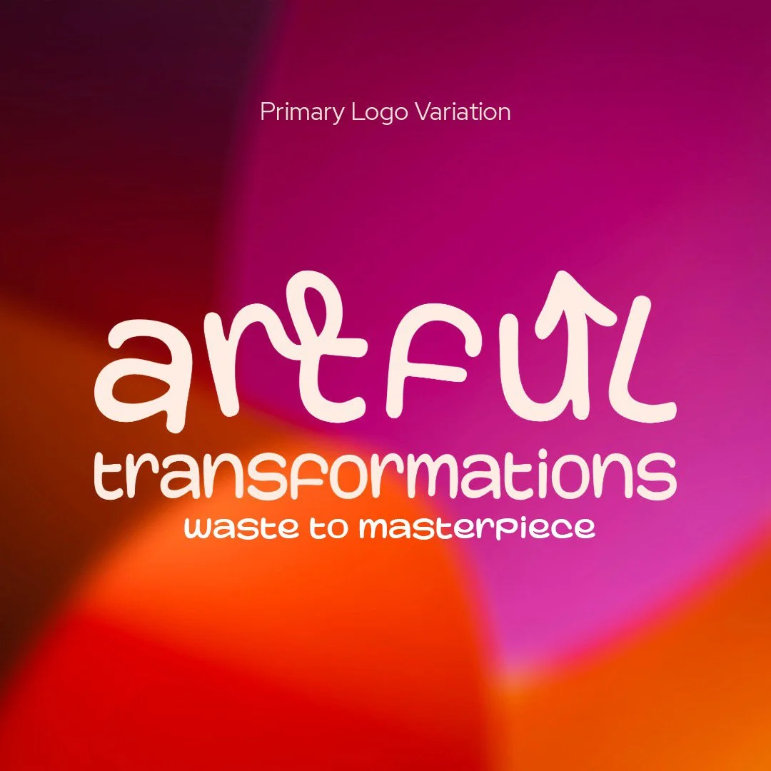
Variation One: Primary Logo
Your primary logo is the main version of your brand identity. It’s the most complete and detailed version of your logo and will typically include:
Your business name
Tagline or descriptor (if applicable)
Brand icon or symbol
This is the version that should be used wherever possible – especially in situations where there’s enough space for the full logo to breathe properly.
Common uses for a primary logo include:
Website headers
Business cards
Letterheads
Email signatures
Packaging
Signage
Because it contains the most information, your primary logo is often the strongest representation of your brand — but it’s also usually the least flexible at smaller sizes.
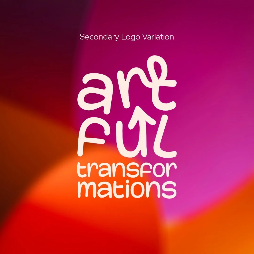
Variation Two: Secondary Logo
Your secondary logo is an alternate version of your primary logo, designed to provide more flexibility across different layouts and applications.
Think of it a bit like the royal line of succession, this guy is your brand’s Prince Harry, or spare – an alternate logo that’s next in line to be used when your primary logo is no longer a good fit.
This version is usually slightly simplified and may include:
A stacked or vertical layout
Removal of the tagline
Adjusted spacing or proportions
Alternate orientation
The goal of a secondary logo is to help your branding adapt to spaces where the primary logo may feel awkward, over/undersized or unbalanced.
Secondary logos are particularly useful for:
Alternative layout orientations
Social media graphics
Presentation slides + document footers
Marketing collateral
You’ll be surprised how often you end up needing this one.
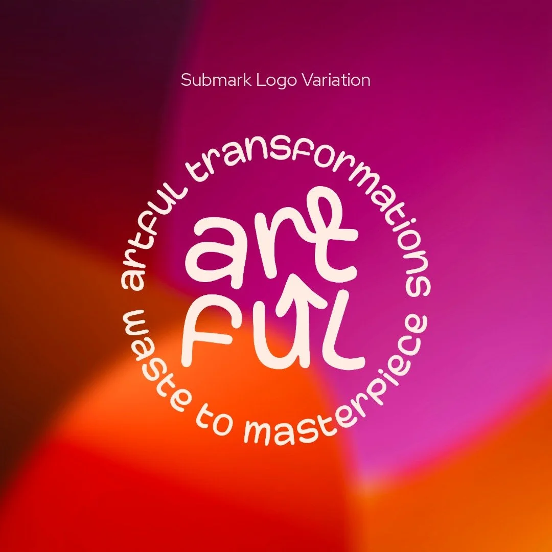
Variation Three: Submark
A submark is a creative, often badge or emblem-like version of your logo that’s ideal for compact spaces as well as more expressive applications.
This variation is often circular in style and can feature details like:
Initials
Monograms
Abbreviations
Tagline
Simplified icon combinations
Founding year
They’re super flexible and are generally best used where your primary logo, brand name or team are already present, including:
Social media profile photos
Website footers
Mobile website headers
Stickers + stamps
Embroidery + clothing
Product tags
Submarks help add a level of depth to your brand’s visual identity (with a little side of whimsy).
Variation Four: Brand Mark or Favicon
This is the most simplified version of your brand identity. A brand mark or favicon is often just one or a combination of:
A single initial
Monogram
Symbol
Icon extracted from the primary logo
This variation is designed for the smallest possible applications – places where your full brand name either isn’t necessary or simply won’t be visible at such a small size, including:
Website favicons (browser icons)
App icons
Social media highlights or icons
Website footers
Embroidery + clothing
Small stickers
Bullet points and graphic accents
Because these applications are so small, simplicity is key. At favicon size, even the cleanest primary logo can become an unrecognisable blob. For this reason, it’s also worth noting this logo variation should also be prioritised over the submark variation in brand systems where only three variations are provided.

Bonus: Brand Elements
While they’re not technically logos, brand elements play a huge role in creating a cohesive and recognisable visual identity. Think of them as your logo’s fun cousins.
Brand elements are supporting visuals derived from your branding system. Rather than using your business name directly, they pull from existing creative elements within your brand personality or verbal identity to create additional visual assets, including:
Icons
Illustrations
Patterns
Graphic shapes
Textures
Decorative linework
Much like the submark, they can add a lot of depth, personality and playfulness to your branding. They also help you show up consistently visually beyond just your logo itself, and work beautifully across:
Website + presentation backgrounds
Social media graphics
Print collateral
Packaging + branded tissue paper
Small stickers
Bullet points and graphic accents
General marketing materials
These supporting assets help transform your branding from “just a logo” into a complete and cohesive brand experience.

Your logo should work everywhere
A strong brand identity isn’t built around one single logo – it’s built around a flexible visual system designed to adapt across every touchpoint.
When thoughtfully designed, logo variations help your branding remain:
Recognisable
Professional
Legible
Versatile
Consistent
Wherever. It. Appears.
Need help crafting your own logo and branding? Explore my branding packages today to discover how I could help you create your own unforgettable brand identity.
You may also like


I’m sharing my take on why Squarespace is most likely the best website platform option for your small business.