
Top 5 tips for small business owners DIY’ing their website design

FROM HOT MESS TO WEB BLESSED“Your website tells your audience everything they need to know about your business, and if your it is poorly designed, looks unprofessional, doesn’t answer your customers most common questions, and makes them feel overwhelmed and confused, how do you think they're going to feel about your business and what you sell?”
I don’t mean to freak you out, but most people form an opinion about your website within seconds of landing on it.
As a website designer, I can usually tell whether a website is “good” or not in about 0.5 seconds – and whether they realise it or not, your customers are doing exactly the same thing.
Your website tells your audience everything they need to know about your business, and I don’t just mean this literally – as in, "what do you do?” – but I mean it from a design perspective, or *vibes*.
If your website is poorly designed, looks unprofessional, doesn’t answer your customers most common questions, and makes them feel overwhelmed and confused – and dare I say it, angry – how do you think they're going to feel about your business and what you sell?
Bingo. Not. Good.
That’s why the design of your website is so important, because this first impression is really not one you want to stuff up.
So if you’re DIY’ing your website, here are five of the biggest things you can do to instantly make it feel more professional, trustworthy and user-friendly (with lots of bonus tips and tricks sprinkled on top).
1. Invest in professional branding and photography
This is where a lot of businesses accidentally put the cart before the horse. Your branding and photography should ideally come before your website design, because they shape the entire direction of your site visually and strategically.
One of the biggest mistakes I see in DIY websites is:
too many fonts
too many colours
no consistent visual direction
Good branding solves most of this for you before you even start building. But if professional branding isn’t in the budget yet, stick to these rules:
Fonts - Use a maximum of 3:
1 heading font
1 body font
1 accent font
Colours - Stick to:
1 primary colour
1 secondary colour
1 accent colour
1 dark neutral (black or close to)
1 light neutral (white or close to)
And when it comes to photography: professional photos will always elevate your website. But if that’s not possible right now, your best smartphone photos will usually feel far more authentic and trustworthy than stock photography or AI-generated images.

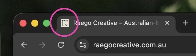
2. Add a custom branded favicon
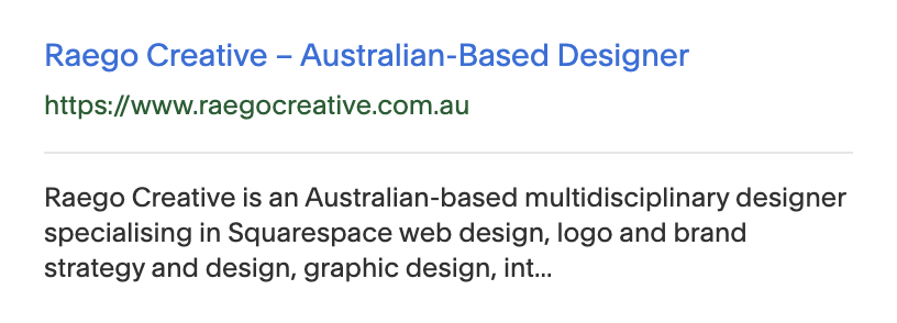
Your favicon is the tiny icon that appears in browser tabs and sometimes next to your website in results on search engines like Google.
Tiny detail? Yes.
Important? Also yes.
It’s often one of the first impressions people see of your brand online, and this is usually before they’ve even made it to your website.
Leaving it blank instantly makes a website feel unfinished and less professional (I’m looking directly at you little grey Squarespace cube!).
If you don’t have one, look at some of your favourite brands or social platforms for inspiration and create a simple one in Canva.
3. Keep everything simple
This applies to basically everything on your website.
There’s nothing worse than landing on a site that immediately overwhelms you with a confusing navigation, pop-ups getting in your way, animations flying everywhere, and no clear direction on where to click next.
It’s a sure-fire way to have your potential clients wanting to throw their device into the trash. Don’t be that website.
A few easy ways to keep things clean and user-friendly:
Keep navigation in familiar locations
Make your logo link back to the homepage
Limit pop-ups to one max
Use animations sparingly
Avoid giant walls of text
Break content down into sections or dot points
Keep your main site pages to around five:
Home
Products/Services
Portfolio
About
Contact
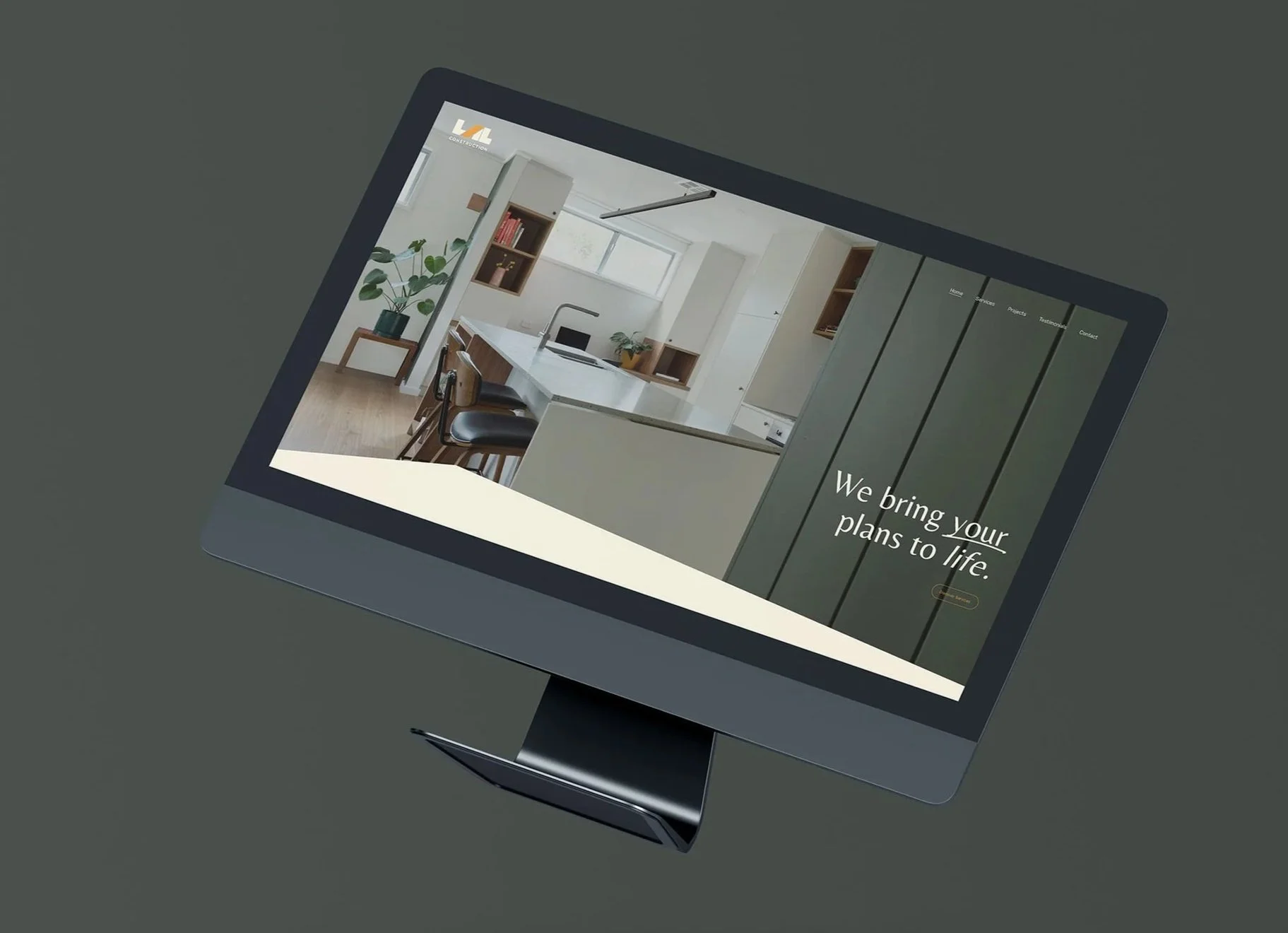
And one of my favourite website rules:one page = one message. Apart from your homepage, each page should focus on one clear topic or goal, so your customers know exactly what they should be doing next.
4. Don’t ignore SEO
A beautiful website is great – but what’s the point if no one can find it?
Search Engine Optimisation (SEO) is often overlooked in DIY builds – and hey, I get it. If you’re not familiar with how it works and what it does, it can be overwhelming to even know where to start.
But it plays a crucial role in getting your website seen – especially with the rise in AI platforms like ChatGPT which are completely changing the way people find information online.
As an easy starting point – search Google as if you were looking for a business like yours and pay attention to the words and phrases that keep appearing. Those are often great clues for keywords to naturally include throughout your website copy.
And if you’re building your site on a platform like Squarespace, you can easily take care of your site’s SEO with built-in tools such as SEO setup checklists and reports, AI prompt builders, automatic sitemaps, and guided in-page SEO settings.
At a minimum, make sure you:
Use relevant keywords naturally throughout your content
Add page titles and descriptions
Optimise your images by adding relevant file names and alt text, and resizing them to the lowest file size possible (without making them blurry)
Structure your headings properly, e.g. H1, H2, H3 hierarchy
SEO doesn’t have to be complicated, but it does need to be there. Even your most basic attempt at SEO is probably going to be better than ignoring it completely.
5. Make sure it’s mobile responsive
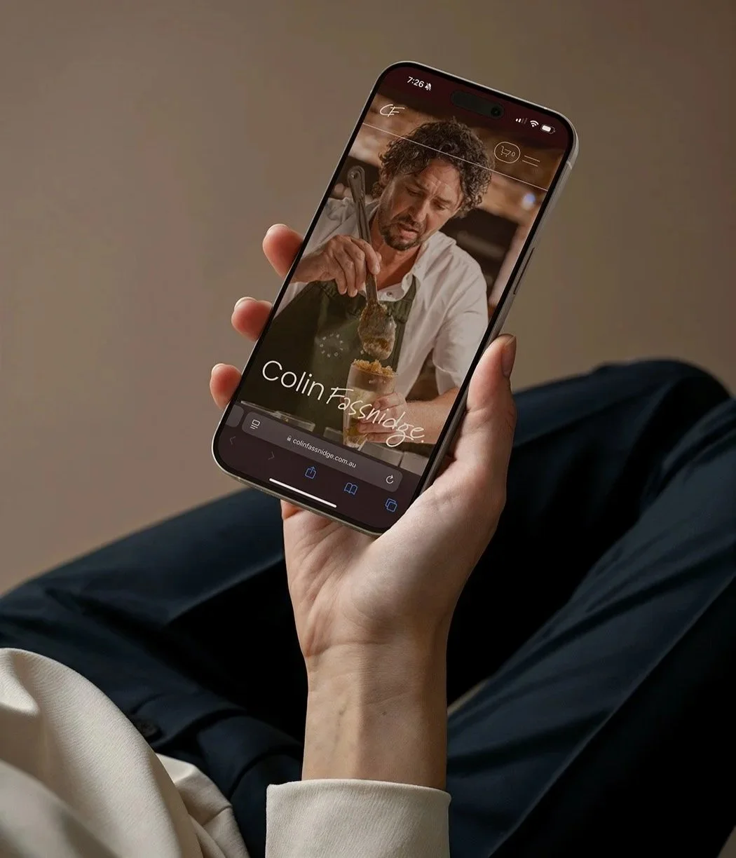
Around 50–80% of your visitors will be viewing your website on their phone. Yah, that’s the overwhelming majority!
So while designing on desktop is easier, mobile experience matters just as much – if not more.
When designing your site, you can either:
design desktop first, then optimise for mobile (I like to do it this way)
or start with mobile and then adapt for desktop
If you’re using a platform like Squarespace, you can easily toggle between views while editing, but I always recommend checking the live site on an actual phone before launching in case there’s anything you need to adjust further based on what you see on a real device.
My top things to check on your mobile design before going live include:
Text is easy to read without zooming
Buttons and links are large enough to tap
Images are scaled properly
Spacing feels balanced
Content is displayed in the right order
Be in the know
A good website isn’t about cramming in trendy design features or trying to fit in as much information about your business as possible – that’s what us in the biz like to call a hot mess.
The best websites are usually the ones that feel:
clear
trustworthy
easy to navigate
visually consistent
Nail those foundations first, and you’ll already be miles ahead of most DIY websites out there.
Looking for more help on DIY’ing your website? Check out my guide on five things to avoid when designing your own website, or explore my web design packages to discover how I could help you move on from the DIY life with a professionally designed custom site.
You may also like


If your website has been making you feel all the wrong things lately, I’ve got something that could save you from investing in a whole new website.